It is the collection and manipulation of items of data to produce meaningful information.” In this sense it can be considered a subset of information processing, “the change (processing) of information in any manner detectable by an observer.”
Data processing may involve various processes, including
- Validation – Ensuring that supplied data is clean, correct and useful
- Sorting – arranging items in some sequence and/or in different sets.
- Summarization – reducing detail data to its main points.
- Aggregation – combining multiple pieces of data.
- Analysis – the collection, organization, analysis, interpretation and presentation of data..
- Reporting – list detail or summary data or computed information.
- Classification – separates data into various categories.
Summarization is used to summarize a set of observations, in order to communicate the largest amount of information as simply as possible. Statisticians commonly try to describe the observations in
- a measure of location, or central tendency, such as the arithmetic mean
- a measure of statistical dispersion like the standard deviation
- a measure of the shape of the distribution like skewness or kurtosis
- if more than one variable is measured, a measure of statistical dependence such as a correlation coefficient
A common collection of order statistics used as summary statistics are the five-number summary, sometimes extended to a seven-number summary, and the associated box plot. Entries in an analysis of variance table can also be regarded as summary statistics.
Examples of summarization statistics
- Location – Common measures of location, or central tendency, are the arithmetic mean, median, mode, and interquartile mean.
- Spread – Common measures of statistical dispersion are the standard deviation, variance, range, interquartile range, absolute deviation and the distance standard deviation. Measures that assess spread in comparison to the typical size of data values include the coefficient of variation. The Gini coefficient was originally developed to measure income inequality and is equivalent to one of the L-moments. A simple summary of a dataset is sometimes given by quoting particular order statistics as approximations to selected percentiles of a distribution.
- Shape – Common measures of the shape of a distribution are skewness or kurtosis, while alternatives can be based on L-moments. A different measure is the distance skewness, for which a value of zero implies central symmetry.
- Dependence – The common measure of dependence between paired random variables is the Pearson product-moment correlation coefficient, while a common alternative summary statistic is Spearman’s rank correlation coefficient. A value of zero for the distance correlation implies independence. Once failure data have been collected it is often useful to display them in graphical format. Key reliability metrics include
- Probability density function (PDF) can be plotted as a histogram showing the number of failures in each time block.
- The hazard function shows the failure rate as a function of time. It is convenient to use the following formula for the hazard function

- The reliability function plots reliability as a function of time. The formula:

Histograms
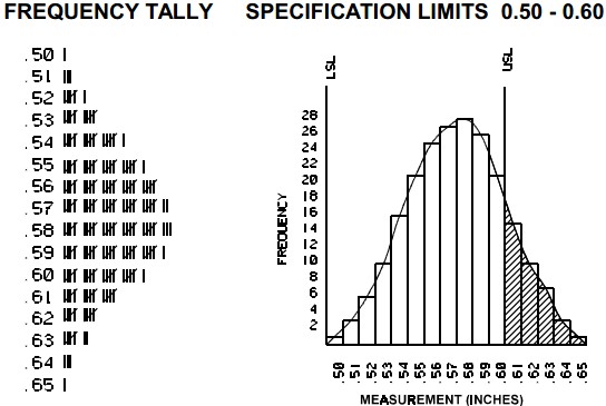
It shows frequencies in data as adjacent rectangles, erected over intervals with an area proportional to the frequency of the observations in the interval. They are frequency column graphs that display a static picture of process behavior and require a minimum of 50-100 data points. It is characterized by the number of data points that fall within a given bar or interval or frequency. It enables the user to visualize how the data points spread, skew and detect the presence of outliers. A stable process which is predictable, usually shows a histogram with bell-shaped curves which is not shown with unstable process even though shapes like exponential, lognormal, gamma, beta, Poisson, binomial, geometric, etc. are a stable process.

The construction of a histogram starts with the division of a frequency distribution into equal classes, and then each class is represented by a vertical bar. They are used to plot the density of data especially of continuous data like weight or height.

