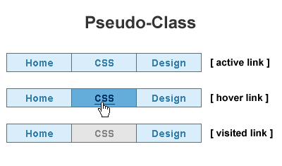
The following are considered dynamic pseudo-classes. They are used to style hyperlinks after certain user actions have occurred.
They are the pseudo-classes which format links in four different states based on how a visitor has interacted with that link. They identify the states of a link as
- :link : It signifies styling for unvisited hyperlinks
- :visited : It indicates styling for visited hyperlinks as per the web browser’s history.
- :hover : It specifies styling of an hyperlink as the mouse passes over it.
- :focus : It denotes styling for an hyperlink that currently has focus as user has used their keyboard or mouse to navigate to a link
- :active : It indicates styling for an hyperlink on which the user is currently clicking
Applying styles to an anchor regardless of its state needs the usage of <a> tag type selector without a pseudo class. Highlighting specific links which are identified by a class name or ID can be done by
.classname1:hover or #idname1:hover
:link – It refers to an unvisited hyperlink and separate styles based on user actions. The default style applied by browser is to color the element as blue. This pseudo-classes apply only the <a> element. It is used as
a:link {
<CSS RULES> }
<CSS RULES> }
:visited – It refers to visited hyperlinks and work as per user action. The default style applied by browser is to color the element as purple. This pseudo-classes apply only the <a> element. It is used as
a:visited {
<CSS RULES> }
<CSS RULES> }
:hover and :focus – It is used to provide useful visual feedback for buttons on a navigation bar. It can be applied to other tags also like <p> tag for highlighting but it is not supported by IE6. :hover refers to an element on which the mouse pointer is currently hovering. When mouse pointer is over the element then the stipulated style is applied and on leaving the element, it returns to the previously stated style. It behaves in same way for mouse or for keyboard focus.
Both :hover and :focus pseudo-classes are applied similar as the :link and :visited pseudo-classes are applied. Their usage is shown in the example in which the <a> tag becomes bold if mouse hovers over it or the keyboard to navigates to it
a:focus, a:hover {
font-weight : bold; }
font-weight : bold; }
:active – It refers to a state when an element is clicked and the mouse button is held down. The indicated style remains in place while the user holds down the mouse button, and the element does not return to its original state until the user releases the mouse button.
The following code shows the :active pseudo-class in use. When the user clicks an <a> element,
while the mouse button is held down, and before it is released, the element is said to be active, in
which case the styles in the :active pseudo-class rule are applied.
while the mouse button is held down, and before it is released, the element is said to be active, in
which case the styles in the :active pseudo-class rule are applied.
It can be applied to other tags also like <p> tag for highlighting but it is not supported by IE6. Its usage is shown
a:active
{ color: brown; }
{ color: brown; }
The pseudo class for links is explained as


