After identifying defects or failures than the root cause need to be identified. The essential tool for this purpose is the cause-and-effect diagram, also called the fishbone or Ishikawa diagram and the scatter diagram
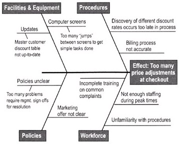
Cause and Effect Diagram
It helps teams uncover potential root causes by providing structure to cause identification effort. It is also called as fishbone or Ishikawa diagram. It helps in ensuring new ideas being generated during brainstorming by not overlooking any major possible cause.
It should be used for cause identification after clearly defining the problem. It is also useful as a cause—prevention tool by brainstorming ways to maintain or prevent future problems.
Developing Cause and Effect Diagram – It involves the following steps
- Name the problem or effect of interest. Be as specific as possible.
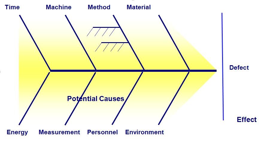
- Write the problem at the head of a fishbone “skeleton”
- Decide the major categories for causes and create the basic diagram on a flip chart or whiteboard.
- Typical categories include the manpower, machines, materials, methods, measurements and environment
- Brainstorm for more detailed causes and create the diagram either by working through each category or open brainstorming for any new input.
- Write suggestions onto self-stick notes and arrange in the fishbone format, placing each idea under the appropriate categories.
- Review the diagram for completeness.
- Eliminate causes that do not apply
- Brainstorm for more ideas in categories that contain fewer items
- Discuss the final diagram. Identify causes which are most critical for follow-up investigation.
They break problems down into small-size pieces and displays possible causes in a graphical manner. They display how various causes interact with each other and uses brainstorming rules when generating ideas. A fishbone diagram development consists of brainstorming, prioritizing and development of an action plan.
It highlights potential causes of a particular problem or the effect. During measure phase, it is used to brainstorm potential x data.
Scatter Diagram
It displays multiple XY coordinate data points represent the relationship between two different variables on X and Y-axis. It is also called as correlation chart. It depicts the relationship strength between an independent variable on the vertical axis and a dependent variable on the horizontal axis. It enables strategizing on how to control the effect of the relationship on the process. It is also called scatter plots, X-Y graphs or correlation charts.
It graph pairs of continuous data, with one variable on each axis, showing what happens to one variable when the other variable changes. If the relationship is understood, then the dependent variable may be controlled. The relationship may show a correlation between the two variables though correlation does not always refer to a cause and effect relationship. The correlation may be positive due to one variable moving in one direction and the second variable in the same direction but, for negative correlation both move in opposite directions. Presence of correlation is due to a cause-effect relationship, a relationship between one cause and another cause or due to a relationship between one cause and two or more other causes.
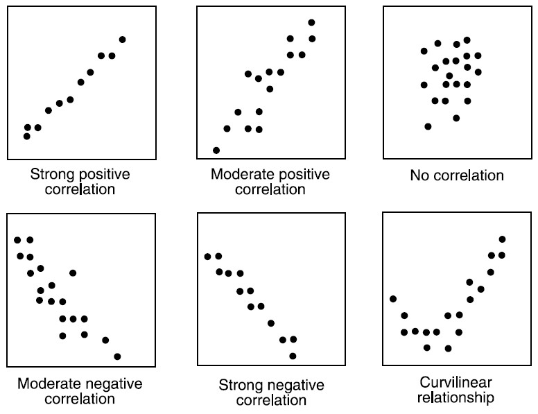
It is used when two variables are related or evaluating paired continuous data. It is also helpful to identify potential root causes of a problem by relating two variables. The tighter the data points along the line, the stronger the relationship amongst them and the direction of the line indicates whether the relationship is positive or negative. The degree of association between the two variables is calculated by the correlation coefficient. If the points show no significant clustering, there is probably no correlation.
Developing Scatter Diagram
- Collect data for both variables.
- Draw a graph with the independent variable on the horizontal axis (x) and the dependent variable on the vertical axis (y).
- For each pair of data, plot a dot (or symbol) where the x-axis value intersects the y-axis value.
