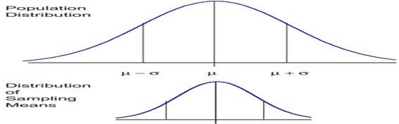
The central limit theorem is the basis of many statistical procedures. The theorem states that for sufficiently large sample sizes ( n ≥ 30), regardless of the shape of the population distribution, if samples of size n are randomly drawn from a population that has a mean µ and a standard deviation σ , the samples’ means X are approximately normally distributed. If the populations are normally distributed, the sample’s means are normally distributed regardless of the sample sizes. Hence, for sufficiently large populations, the normal distribution can be used to analyze samples drawn from populations that are not normally distributed, or whose distribution characteristics are unknown. The theorem states that this distribution of sample means will have the same mean as the original distribution, the variability will be smaller than the original distribution, and it will tend to be normally distributed.
The basic tenants of the central limit theorem revolve around the sampling of distribution and the mean approaches of a normal distribution, as the sample size number increases over time. Now consider the effect of increasing the sample size and what that does to the shape of the data.
An example shows that you have 100 samples and if you take that and you do the calculations, it gives you a curve. If you increase you sample size to 500, the arc of the curve becomes higher and steeper. When you increase the sample size to 1000, you see this theory of large numbers or the central limit theorem coming into play and the arc of the curve becomes even higher and steeper. This gives you what you expected as the sample size gets larger.
When means are used as estimators to make inferences about a population’s parameters and n ≥ 30, the estimator will be approximately normally distributed in repeated sampling. The mean and standard deviation of that sampling distribution are given as µx = µ and σx = σ/√n. The theorem is applicable for controlled or predictable processes. Most points on the chart tend to be near the average with the curve’s shape is like bell-shaped and the sides tend to be symmetrical. Using ± 3 sigma control limits, the central limit theorem is the basis of the prediction as, if the process has not changed, a sample mean falls outside the control limits an average of only 0.27% of the time. The theorem enables the use of smaller sample averages to evaluate any process because distributions of sample means tend to form a normal distribution.
Confidence Interval
You use confidence intervals to determine, at different levels of confidence, what that given interval estimate is for the population. It’s a test of whether a parameter is true, calculated from the observations. What you want to do is understand what’s going on.
For example, in a symmetrical bell curve, the measurement is expected to fall between the range of 9.1 and 9.3. So what you want to know is how reliably can you expect the value to fall within the range at 95% confidence factor? To test that, you would want to be able to look at the confidence interval and know, working off the mean, what you are getting with this particular process.
Statistical and hypothesis testing
Statistical and hypothesis testing is an assumption about the population parameter. This assumption may or may not be true. Hypothesis testing refers to the formal procedures that you use to accept or reject statistical hypotheses. The best way to determine whether the statistical hypothesis is true would be to examine the entire population, but that’s usually impractical. So typically you’re going to examine a random sample from the population and find out if that data is consistent with your statistical hypothesis. If it’s not, you can reject it.
There are two types of hypothesis that you can draw – a null hypothesis or an alternative hypothesis:
- a null hypothesis is denoted by the capital letter H with the subscript zero, and usually indicates that the sample observations resulted as expected purely by chance
- an alternative hypothesis is denoted by the capital letter H with the subscript a, and indicates that the samples are influenced by some other random cause
For example, suppose you wanted to determine whether a coin flip was fair and perfectly balanced. A null hypothesis might be that half of the flips would result in heads and half of the flips in tails. Then suppose you actually flip the coin 50 times with a result of 40 heads and just 10 tails. Given this result, you’d be inclined to reject the null hypothesis. You’d conclude, based on the evidence, that the coin flip is probably not fair and evenly balanced.
Control charts
Control charts are one of the more important tools that you use in measuring and providing feedback to organizations and are loaded with lots of great information that you can leverage. Just like a run chart, you’re looking for trends in the data, such as average trending upward, trending downwards, or signals of big problems with your process.
For example, the y-axis on a graph shows values that range from 1 to 12, and on the x-axis, the values range from 0 to 20, typically showing time in days, weeks, or seconds, depending on the process. You have an upper control limit (UCL) and a lower control limit (LCL). These are the levels at which you will be exceeding the design parameters you’re looking for. In this example, the UCL is set at the value 9 on the y-axis and runs parallel to the x-axis. The LCL is set at the value 3 on the y-axis and runs parallel to the x-axis.
A control chart can show the value of a measured variable over time. It’s important that you watch the chart to ensure the plotted values don’t move above the UCL or below the LCL. This would trigger actions to re-measure or re-evaluate your process and trigger root cause analysis.
At a level above the UCL, you’d reject or scrap the part and at a level below the LCL, you would rework, fix, or scrap the part. You want to see that you stay between these two limits. There is also a target, or center line, which is set at the value 6 on the y-axis in this example and runs parallel to the x-axis. In this example, 20 points are plotted, two are above the UCL and two are below the LCL.
