
In the fast-paced world of web development, staying ahead of the curve requires mastering tools that streamline your workflow and enhance the user experience. Learn Bootstrap: an open-source front-end framework that has revolutionized how developers create responsive, visually appealing websites. With its robust set of pre-designed components and a focus on mobile-first design, learning Bootstrap is not just a beneficial skill, but a game-changer that every web developer must embrace to thrive in today’s competitive digital landscape.Bootstrap is a powerful front-end framework for web development that simplifies the process of building responsive and visually appealing websites. It provides developers with a comprehensive set of tools, components, and styles to streamline the creation of user interfaces while ensuring consistency and compatibility across different devices and browsers.
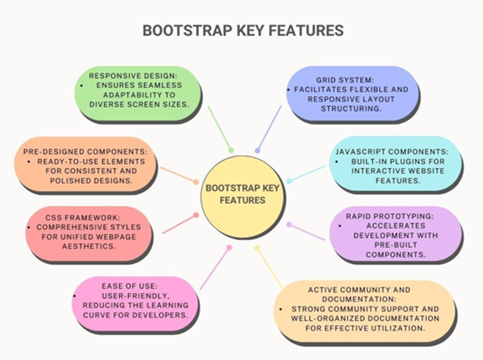
Key Aspects of Bootstrap
Responsive Design
- Ensures websites adapt seamlessly to different screen sizes.
- Utilizes a responsive grid system for fluid layouts.
- Example: Crafting a website with Bootstrap allows effortless adjustment to various devices, maintaining a consistent user experience.
Grid System
- Facilitates the creation of responsive layouts with ease.
- Divides pages into rows and columns for structured designs.
- Example: Constructing layouts with Bootstrap’s grid system involves simple application of CSS classes, enabling dynamic adjustments based on screen size.
Pre-styled Components
- Includes buttons, forms, navigation bars, etc., with predefined styles.
- Ensures visual consistency across browsers.
- Example: Incorporating a navigation bar into a website using Bootstrap’s pre-styled component saves time and ensures a professional appearance.
Example: Consider yourself tasked with building a portfolio website for a client. Opting to leverage Bootstrap, you embark on the development journey with confidence. Employing Bootstrap’s responsive design features and grid system, you swiftly construct a layout that gracefully adapts to various devices. Additionally, integrating pre-styled components like buttons and forms enhances the website’s aesthetic appeal and user experience. The end result is a polished and modern website that showcases your client’s work seamlessly across desktops, tablets, and smartphones, all made possible by Bootstrap’s intuitive framework.
History and Origins of Bootstrap
Essential features of Bootstrap
Certification with Vskills offers a distinct advantage by providing industry-recognized validation of skills, enhancing employability and career prospects. With Vskills, individuals can access comprehensive training and assessments, ensuring proficiency in relevant domains and staying competitive in today’s job market.
Learn more about how to become a Certified Bootstrap Professional.
Important components to Learn bootstrap
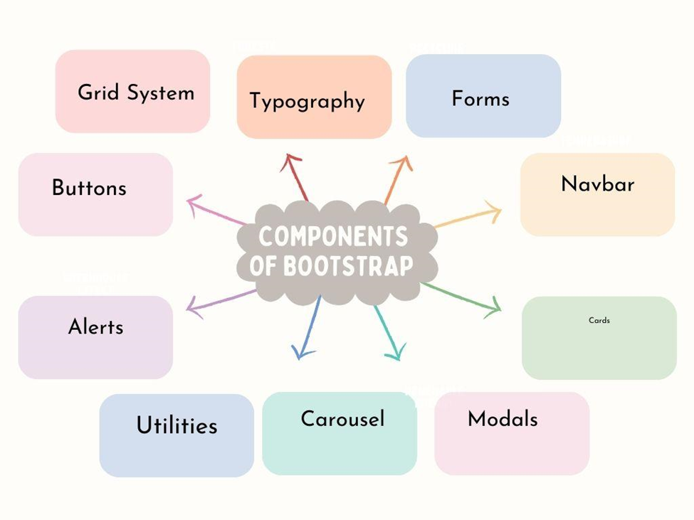
Bootstrap offers a wide range of components that are essential for building modern and responsive web applications. Some of the important components of Bootstrap include:
- Grid System: Bootstrap’s grid system serves as the backbone for crafting responsive layouts, enabling developers to organize webpage content into rows and columns across various screen sizes with precision.
- Typography: Bootstrap furnishes a set of typographic styles for elements like headings, paragraphs, and lists, ensuring uniform and visually pleasing text presentation throughout the website.
- Forms: With pre-styled form controls such as input fields, checkboxes, and select dropdowns, Bootstrap streamlines form creation while maintaining consistent styling across browsers.
- Buttons: Bootstrap offers a versatile array of button styles and sizes, easily customizable to align with diverse design needs, and complemented by support for icons and dropdowns for enhanced interactivity.
- Navbar: The Bootstrap navbar delivers a responsive navigation bar adaptable to different devices, complete with features like dropdown menus, navigation links, and brand logos, alongside mobile-friendly toggling.
- Cards: Bootstrap’s card component provides lightweight containers for content presentation, offering flexibility and customization options ideal for showcasing articles, images, or user profiles in an organized manner.
- Modals: Bootstrap modals are pop-up dialogues overlaying webpage content, commonly utilized for displaying alerts, forms, or supplementary information without redirecting users.
- Carousel: Bootstrap’s carousel component facilitates the creation of image sliders or carousels, featuring autoplay functionality, navigation controls, and indicators to guide users through the content rotation.
- Alerts: Bootstrap’s alert component delivers visually distinct messages to convey important information to users, available in various styles like success, warning, and danger, with optional dismissibility.
- Utilities: Bootstrap’s utility classes offer a comprehensive toolkit for applying common CSS styles, including spacing, alignment, visibility, and text manipulation, streamlining development and ensuring styling consistency.
Benefits of Learning Bootstrap
Top 10 Reasons for Learning Bootstrap as a Beginner
- Effortless Development Process: Bootstrap simplifies website development for beginners by offering a comprehensive framework with pre-built components and styles. For instance, instead of coding a navigation bar from scratch, beginners can use Bootstrap’s pre-designed navigation component, saving time and effort.
- Seamless Responsive Design: With Bootstrap’s grid system, beginners can easily create responsive layouts that adapt to different screen sizes and devices. For example, a beginner can use Bootstrap’s grid classes to arrange content in a responsive grid, ensuring optimal viewing experiences across devices.
- Consistent User Experience: Bootstrap’s design conventions ensure visual consistency across projects. For instance, by using Bootstrap’s predefined styles and components consistently, beginners can create a cohesive user experience across different pages of a website.
- Abundant Component Library: Bootstrap offers a vast library of pre-designed components, such as buttons, forms, and cards. Beginners can leverage these components to build functional websites without having to design every element from scratch.
- Easy Customization Options: While Bootstrap provides ready-to-use components, it also allows for extensive customization. For instance, beginners can customize Bootstrap’s default styles to match the branding of their project, creating a unique and personalized design.
- Cross-Browser Compatibility: Bootstrap ensures compatibility across various web browsers, saving beginners from the hassle of dealing with browser-specific issues. By using Bootstrap, beginners can build websites confidently, knowing they will work seamlessly on different browsers.
- Faster Development Time: By utilizing Bootstrap’s pre-designed components and responsive grid system, beginners can significantly reduce development time. For instance, instead of coding CSS for responsive layouts from scratch, beginners can use Bootstrap’s grid classes to achieve responsiveness quickly.
- Community Support and Resources: Bootstrap has a thriving community of developers who contribute tutorials, plugins, and resources. Beginners can benefit from this community by accessing helpful tutorials, seeking guidance on forums, and learning from others’ experiences.
- Scalability and Flexibility: Bootstrap is scalable and flexible, making it suitable for projects of all sizes. Beginners can start with small projects and gradually transition to larger ones, confident in Bootstrap’s ability to adapt to their evolving needs.
- Enhanced Career Opportunities: Learning Bootstrap enhances beginners’ skillsets and makes them more attractive to potential employers. By showcasing proficiency in Bootstrap, beginners can improve their career prospects and pursue opportunities in web development roles.
Click here to know more: Why you should learn Bootstrap
Significance of Bootstrap for Aspiring Web Developers
Bootstrap acts as a front-end framework for web development, offering a suite of tools to simplify and enhance the creation of websites and web applications. Here’s a summary of its key purposes:
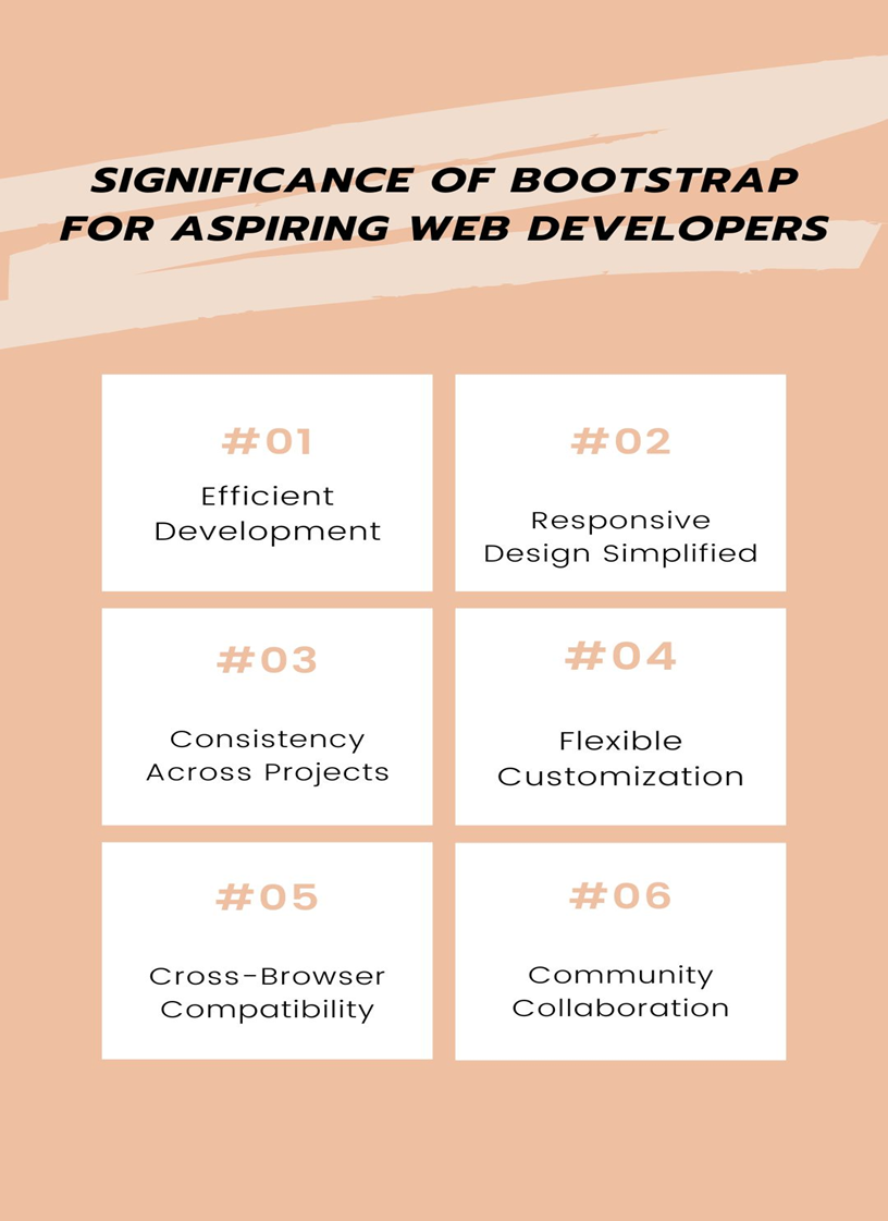
Efficient Development:
- Bootstrap’s extensive library of pre-designed components and styles accelerates the development process.
- Developers leverage these components to construct intricate user interfaces rapidly, reducing the need for extensive custom coding.
- This expedites project completion and allows developers to allocate more time to implementing advanced features and functionalities.
Responsive Design Simplified:
- Bootstrap’s grid system facilitates the creation of responsive layouts that seamlessly adapt to different viewport sizes.
- By utilizing predefined grid classes and breakpoints, developers ensure consistent rendering across various devices and screen resolutions.
- This simplifies the implementation of responsive design principles, enabling developers to deliver optimal user experiences without the complexities of manual CSS adjustments.
Consistency Across Projects:
- Adhering to Bootstrap’s design standards ensures visual consistency across multiple projects.
- Developers adhere to Bootstrap’s predefined styling and layout conventions, fostering a cohesive brand identity and user experience.
- This standardization streamlines collaboration among team members and simplifies project maintenance by establishing a common design language.
Flexible Customization:
- While Bootstrap provides a robust set of default styles and components, it offers extensive customization options to suit diverse project requirements.
- Developers can leverage Bootstrap’s customizable variables, mixins, and utility classes to tailor the appearance and behavior of elements.
- This flexibility enables developers to create bespoke designs that align with specific branding guidelines and user preferences.
Cross-Browser Compatibility
- Bootstrap undergoes rigorous testing to ensure compatibility across various web browsers, including Chrome, Firefox, Safari, and Edge.
- Developers can rely on Bootstrap’s cross-browser compatibility to deliver consistent user experiences without the need for browser-specific adjustments.
- This enhances the accessibility and usability of websites across different platforms and devices, bolstering user satisfaction and engagement.
Community Collaboration:
- Bootstrap benefits from a vibrant community of developers who contribute plugins, extensions, and resources to enhance its functionality.
- This collaborative ecosystem fosters innovation and knowledge sharing, as developers collaborate on projects and share insights and best practices.
- Developers can tap into the wealth of community-contributed resources to extend Bootstrap’s capabilities and address specific project requirements more efficiently.
Understanding Grid System: Learn Bootstrap
Bootstrap’s grid system is a foundational aspect of the Bootstrap framework, offering a structured layout mechanism for developing responsive web designs. It comprises a grid divided into 12 columns, enabling developers to organize web page content in a manner that adjusts seamlessly across various screen sizes and devices.
Here’s how Bootstrap’s grid system simplifies responsive design:
Flexible Layout Structure: Bootstrap’s grid system allows developers to create layouts that fluidly adapt to different screen dimensions. For instance, consider a webpage with two columns on desktop screens. Using Bootstrap’s grid classes, developers can designate one column to occupy two-thirds of the screen width and the other to take up one-third.
Example:
| <div class=”row”> <div class=”col-md-8″>Main Content</div> <div class=”col-md-4″>Sidebar</div> </div> |
Responsive Breakpoints: Bootstrap provides predefined breakpoints for different screen sizes, such as extra small (xs), small (sm), medium (md), large (lg), and extra-large (xl). Developers can use these breakpoints to define how the layout should change at various screen widths, ensuring that the design looks good on all devices.
Example:
| <div class=”row”> <div class=”col-md-6 col-sm-12″>Column 1</div> <div class=”col-md-6 col-sm-12″>Column 2</div> </div>/div> </div> |
Grid Classes for Easy Implementation: Bootstrap offers a set of predefined grid classes, such as .col-xs-, .col-sm-, .col-md-, .col-lg-, and .col-xl-, which developers can apply directly to HTML elements. These classes specify the width of the columns at different breakpoints, making it easy to create responsive layouts without writing custom CSS.
Example:
| <div class=”row”> <div class=”col-lg-3 col-md-6 col-sm-12″>Column 1</div> <div class=”col-lg-9 col-md-6 col-sm-12″>Column 2</div> </div> |
Nesting and Offset Columns: Bootstrap allows for nesting columns within columns, enabling developers to create intricate layouts. Additionally, developers can use offset classes to create space between columns or align them differently within the grid.
Example:
| <div class=”row”> <div class=”col-md-8″>Main Content</div> <div class=”col-md-4″> <div class=”row”> <div class=”col-md-6″>Subcontent 1</div> <div class=”col-md-6″>Subcontent 2</div> </div> </div> </div> |
Learn Bootstrap: Develop with Pre-designed Components
For beginners stepping into web development, Bootstrap’s collection of pre-designed components and styles serves as a valuable asset, significantly easing the process of building functional and visually appealing websites. Here’s how these components can be beneficially implemented:
Navbar:
● Simplifies navigation bar creation.
● Allows beginners to integrate branding elements and navigation links easily.
● Saves time and effort with pre-designed styling and responsive behavior.
| <nav class=”navbar navbar-expand-lg navbar-light bg-light”> <a class=”navbar-brand” href=”#”>Logo</a> <!– Navigation links here –> </nav> |
Buttons:
● Offers a variety of styles and sizes for buttons.
● Enables beginners to enhance website interactivity with clear call-to-action elements.
● Provides ready-made styling for primary, secondary, and other button variants.
| <button type=”button” class=”btn btn-primary”>Primary Button</button> <button type=”button” class=”btn btn-secondary”>Secondary Button</button> |
Forms:
● Streamlines form creation with pre-styled components.
● Helps beginners design input fields, checkboxes, and radio buttons effortlessly.
● Ensures consistency and improves usability across different form elements.
| <form> <div class=”form-group”> <label for=”exampleInputEmail1″>Email address</label> <input type=”email” class=”form-control” id=”exampleInputEmail1″ aria-describedby=”emailHelp” placeholder=”Enter email”> </div> <!– Other form elements here –> </form> |
Cards:
● Versatile content containers suitable for various types of information.
● Provides a structured layout with customizable header, body, and footer sections.
● Allows beginners to populate cards with text, images, and buttons for engaging content blocks.
| <div class=”card” style=”width: 18rem;”> <img src=”…” class=”card-img-top” alt=”…”> <div class=”card-body”> <h5 class=”card-title”>Card title</h5> <p class=”card-text”>Some quick example text to build on the card title and make up the bulk of the card’s content.</p> <a href=”#” class=”btn btn-primary”>Go somewhere</a> </div> Real-world examples of websites or projects built using Bootstrap Bootstrap’s extensive toolkit and user-friendly components empower new web developers to effortlessly craft professional-grade websites. Real-world examples showcase Bootstrap’s versatility: Portfolio Websites: Graphic designers utilize Bootstrap’s grid system for project organization, navigation bars for easy browsing, and card components for project showcases. Blog Websites: Aspiring bloggers leverage Bootstrap’s pre-designed components for layout structure and styling, including grid systems for captivating blog layouts and form styling for user engagement. E-commerce Websites: Small business owners utilize Bootstrap’s grid system for product arrangement, responsive navbars for seamless navigation, and card components for product displays. Additionally, form styling enhances user registration and checkout processes. Bootstrap’s simplicity and versatility make it the preferred choice for beginners seeking to create impressive websites with minimal coding effort. |
Case Studies to know real experiences
- Case Studies: Successful Bootstrap Stories to Inspire Your Startup Journey
- Successful bootstrapping in SAAS
How to Learn Bootstrap : An easy Path to Professional Websites for beginners
Bootstrap facilitates the creation of professional-looking websites for beginners with minimal effort in the following ways:
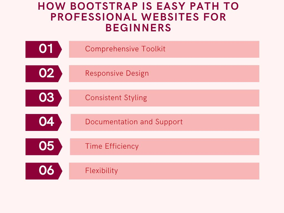
- Comprehensive Toolkit: Bootstrap provides a wide array of pre-designed components like navigation bars, buttons, forms, and cards, allowing beginners to easily incorporate them into their projects without extensive coding.
- Responsive Design: With Bootstrap’s grid system, websites automatically adjust to various screen sizes and devices, ensuring a professional appearance across all platforms without the need for manual tweaking.
- Consistent Styling: Bootstrap ensures consistency in styling across all components, resulting in a cohesive and polished look for the website without the requirement of custom design work.
- Documentation and Support: Bootstrap offers thorough documentation and active community support, making it easy for beginners to learn and implement, find tutorials, examples, and forums to navigate any development challenges.
- Time Efficiency: By leveraging Bootstrap’s pre-designed components and responsive grid system, beginners can significantly reduce development time, enabling them to focus on refining website content and functionality rather than design and layout.
- Flexibility: Bootstrap allows extensive customization, enabling beginners to easily adjust colors, fonts, and other design elements to match their project’s branding and requirements, giving them the freedom to create unique and professional-looking websites.
With VSkills Learn how to become a Bootstrap Developer
Customizing Bootstrap: Tailoring Project’s Look and Feel
Customizing Bootstrap to fit your project’s unique needs involves adjusting themes and applying custom styles. Here’s a beginner-friendly guide on how to do it:
Customizing Themes:
- Using Pre-made Styles: Find styles online that you can apply to your website. Download them and add them to your code.
- Adjusting Theme Settings: Some themes let you change colors and other settings to better suit your website.
- Installing Sass: Sass helps you write CSS faster. Install it on your computer.
- Creating Your Own Style File: Make a special file for your custom styles and tell Bootstrap to use it.
- Modifying Bootstrap’s Styles: With Sass, you can change Bootstrap’s styles to match your vision.
Applying Custom Styles:
- Writing Your Own CSS: Write your own CSS code to make changes without using Sass.
- Customizing Specific Parts: Change how certain parts of Bootstrap look. For example, you can adjust the appearance of buttons or navigation bars.
- Adding Extra Features: Use JavaScript to add special features that Bootstrap doesn’t have out of the box.
Following these steps allows beginners to personalize their websites, making them unique and professional-looking!
Want to become a certified web developer ?
Learning Bootstrap is crucial for new web developers as it lays a strong foundation for building websites that look great on all devices. With Bootstrap, beginners get access to ready-made parts, design tips, and lots of help guides. This makes building websites easier and faster. Plus, because Bootstrap is so popular, there’s a big community of users who can help beginners learn and grow in web development.
