
Starting out in web development can feel like stepping into a vast, complex world full of endless possibilities and challenges. Fortunately, Bootstrap offers a welcoming hand to beginners, making it easier to navigate this new landscape. As one of the most popular front-end frameworks, Bootstrap streamlines the process of building responsive, visually appealing websites. For those just beginning their web development journey, learning Bootstrap isn’t just beneficial—it’s a game-changer. It provides essential tools and design components that help beginners create professional-quality websites more quickly and confidently. In this blog, we’ll dive into why Bootstrap is an essential skill for new developers and how it can make your web development experience smoother and more enjoyable.
Significance of web development skills for beginners
For those just starting out, web development skills are essential since they lay the groundwork for building and managing websites. Being able to create and design websites opens up a variety of chances in the modern digital world. Web development abilities enable beginners to transform their ideas into reality and create an online presence, whether they are creating a blog, an e-commerce platform, or a personal portfolio. In addition to improving particular projects, these abilities also help people gain a deeper comprehension of the digital world, which increases their adaptability and competitiveness across a range of industries.
Importance of choosing the right Tool
In the realm of web development, there is a wide array of tools available, ranging from programming languages and frameworks to libraries and design tools. The importance of choosing the right tools cannot be overstated, as it significantly influences the efficiency, functionality, and overall success of a project.
The plethora of tools includes:

- Choosing the right tools involves considering the specific needs of a project, the skill set of the development team, scalability requirements, and the desired features of the end product. The right tools can enhance productivity, simplify complex tasks, and contribute to the overall success of a web development effort. Equally, using inappropriate or out-dated tools may lead to inefficiencies, compatibility issues, and hinder the development process. Therefore, a thoughtful selection of tools is crucial for achieving ideal results in web development projects.
Why Bootstrap stands out as a crucial skill?
One of the most important skills in web development is to understand the features of Bootstrap and the benefits it provides to developers. Twitter created the Bootstrap front-end framework and it has become popular for several reasons.
- Simplicity and Ease of Use: Bootstrap is famous for its user-friendly nature, making it an ideal choice for both beginners and experienced developers. Its simplicity allows users to quickly grasp and implement its features, significantly reducing the learning curve.
- Responsive Design: In the era of diverse devices and screen sizes, responsive web design is supreme. Bootstrap’s grid system enables the creation of responsive layouts, ensuring that websites adapt seamlessly to various devices, from desktops to smartphones.
- Pre-Designed Components: Bootstrap provides a comprehensive set of pre-designed components such as navigation bars, buttons, forms, and typography. This allows developers to save time by incorporating ready-made elements into their projects, rather than starting from scratch.
- Consistent Cross-Browser Compatibility: Bootstrap is designed to ensure consistent performance across different web browsers. This helps developers avoid the challenges associated with browser-specific issues, ensuring a uniform user experience for all visitors.
- Customization Flexibility: While Bootstrap offers a range of predefined components, it also allows for extensive customization. Developers can easily modify the framework’s styles and components to suit the specific design and functionality requirements of their projects.
- Active Community and Documentation: Bootstrap benefits from a large and active community of developers. This community support, united with comprehensive documentation, makes it easier for developers to find solutions to issues, seek advice, and stay updated on best practices.
- Rapid Prototyping: Bootstrap is particularly valuable for rapid prototyping and iterative development. Its pre-built components and responsive grid enable developers to quickly create prototypes and iterate on design concepts, accelerating the development cycle.
By mastering Bootstrap, developers gain a versatile and efficient tool that simplifies the web development process. Its combination of ease of use, responsiveness, and customization options positions Bootstrap as a crucial skill, enabling developers to create visually appealing, functional, and cross-browser-compatible websites with greater efficiency and confidence.
Simplicity and Ease of Use
a) Highlighting Bootstrap’s user-friendly nature, especially for beginner
Bootstrap’s user-friendly nature makes it particularly accessible for beginners in web development. Here’s why:
- Clear Documentation: Bootstrap comes with extensive and well-documented resources. Clear documentation helps beginners understand the framework’s features, classes, and components, making it easier to get started and build confidence.
- Intuitive Classes: Bootstrap utilizes spontaneous class names for its components. For instance, using the class “btn” for buttons or “container” for layout elements. This simplicity reduces the need for extensive memorization, allowing beginners to quickly grasp and apply Bootstrap’s features.
- Consistent Naming Conventions: Bootstrap maintains consistent naming conventions across its components. Once a beginner understands the naming pattern for one element, they can easily apply the same logic to others, promoting a smoother learning curve.
b) Simplicity of integrating Bootstrap into web projects.
Bootstrap’s seamless integration into web projects contributes to its popularity among developers. Here are key aspects:
CDN Integration: Bootstrap can be integrated into projects using Content Delivery Networks (CDNs), eliminating the need for manual downloads and installations. Beginners can quickly include Bootstrap in their HTML files by adding a few lines of code, reducing setup complexities.
Compatibility with Other Tools: Bootstrap is compatible with popular development tools and workflows. Whether using text editors like Visual Studio Code or integrated development environments (IDEs), Bootstrap easily fits into various development environments without causing conflicts.
Package Managers Support: Bootstrap can be conveniently managed using package managers like npm or yarn. This facilitates version control and makes updating Bootstrap within a project a straightforward process.
c) Examples of How
Bootstrap simplifies coding through its pre-designed components and responsive grid system. Here are examples:
Responsive Grid System: Bootstrap’s grid system allows developers to create responsive layouts without extensive custom coding. For instance, the use of classes like “col-md-6” automatically adjusts column widths based on the screen size, eliminating the need for manual adjustments.
Pre-Styled Components: Bootstrap provides ready-made components like navigation bars, buttons, and forms. Instead of coding these elements from scratch, beginners can incorporate Bootstrap’s pre-styled components, reducing the amount of code they need to write.
Utility Classes: Bootstrap includes utility classes for quick styling adjustments. For instance, adding “text-centre” to an element aligns its text to the centre, providing a simple and efficient way to apply styles without diving deep into CSS.
Time-Efficient Development with Pre-Built Components
a) Explore Bootstrap’s extensive library of pre-built components
Bootstrap’s time-saving capabilities lie in its extensive library of pre-built components, streamlining the development process and allowing developers to focus on functionality rather than reinventing the wheel. Here’s a closer look at commonly used components and how they contribute to time-efficient development:
| Navigation Bars | Bootstrap’s navbar component simplifies the creation of navigation menus. By applying predefined classes, developers can quickly implement responsive navigation bars with dropdowns, brand logos, and navigation links. |
| Forms | Bootstrap provides a range of form elements like input fields, checkboxes, radio buttons, and selects. These components come pre-styled and are easily customizable, allowing developers to create aesthetically pleasing and functional forms with minimal effort. |
| Buttons | With predefined classes, Bootstrap offers a range of button sizes and styles. Developers don’t need to use a lot of custom styling to build aesthetically pleasing buttons because they can select from primary, secondary, success, danger, and other designs. |
b) Examples of commonly used components like navigation bars, forms, and buttons
1. Navigation Bar Example
<nav class=”navbar navbar-expand-lg navbar-light bg-light”>
<a class=”navbar-brand” href=”#”>Your Brand</a>
<button class=”navbar-toggler” type=”button” data-toggle=”collapse” data-target=”#navbarNav” aria-controls=”navbarNav” aria-expanded=”false” aria-label=”Toggle navigation”>
<span class=”navbar-toggler-icon”></span>
</button>
<div class=”collapse navbar-collapse” id=”navbarNav”>
<ul class=”navbar-nav”>
<li class=”nav-item active”>
<a class=”nav-link” href=”#”>Home <span class=”sr-only”>(current)</span></a>
</li>
<li class=”nav-item”>
<a class=”nav-link” href=”#”>Features</a>
</li>
<li class=”nav-item”>
<a class=”nav-link” href=”#”>Contact</a>
</li>
</ul>
</div></nav>
2. Form Example
<form>
<div class=”form-group”>
<label for=”exampleInputEmail1″>Email address</label>
<input type=”email” class=”form-control” id=”exampleInputEmail1″ aria-describedby=”emailHelp” placeholder=”Enter email”>
<small id=”emailHelp” class=”form-text text-muted”>We’ll never share your email with anyone else.</small>
</div>
<div class=”form-group”>
<label for=”exampleInputPassword1″>Password</label>
<input type=”password” class=”form-control” id=”exampleInputPassword1″ placeholder=”Password”>
</div>
<button type=”submit” class=”btn btn-primary”>Submit</button> </form>
3. Button Example
<button type=”button” class=”btn btn-primary”>Primary Button</button>
<button type=”button” class=”btn btn-secondary”>Secondary Button</button>
c) How These Components Save Time and Effort
- Consistent Styling: Because Bootstrap pre-built components have uniform styling, your website will look polished and well-designed from top to bottom. Developers do not have to waste time on minute styling aspects.
- Responsive Design: Certain elements, such as navigation bars, automatically change in order to fit in various screen sizes, saving the user from making manual adjustments. Time is saved and a smooth user experience across a range of devices is guaranteed by this responsiveness.
- Customization Options: Although Bootstrap components provide a default style, they are highly customizable. Developers can easily twist colours, sizes, and other attributes to match the project’s design requirements without starting from scratch.
- Cross-Browser Compatibility: Bootstrap components are designed to work consistently across different browsers. This eliminates the need for extensive testing and adjustments to ensure compatibility, saving valuable development time.
Responsive Design Made Accessible
a) The importance of responsive design in today’s multi-device landscape
In the dynamic landscape of modern web development, responsive design is foremost to ensure ideal user experience across various devices. Bootstrap plays a crucial role in making responsive design accessible to developers. Here’s why:
Importance of Responsive Design
Responsive design is essential in an era where consumer’s access websites from a wide range of devices, including laptops, tablets, smartphones, and desktops. It ensures that a website adapts seamlessly to different screen sizes, resolutions, and orientations. This adaptability not only enhances user experience but is also a key factor in search engine optimization.
B) Introduction of Bootstrap’s responsive grid system
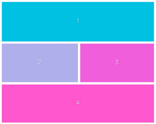
A key component of Bootstrap that makes it easier to create layouts that adapt to various screen sizes is its responsive grid structure. Because the grid system is built on a 12-column layout, developers can specify how wide each column should be for various screen sizes. Because of this versatility, developers may produce designs that are both visually beautiful and responsive without requiring a lot of custom CSS.
c) Examples of Responsive Designs Using Bootstrap

- Navigation Bar: Bootstrap’s navigation bar automatically adjusts its layout for different screen sizes. On larger screens, it might display a full menu with all navigation options, while on smaller screens; it can collapse into a mobile-friendly menu, ensuring a seamless and in-built navigation experience.
- Forms: Forms created with Bootstrap automatically become responsive. Input fields and buttons adjust their size and spacing to provide a user-friendly experience, whether viewed on a large desktop screen or a compact smartphone display.
- Buttons: Bootstrap’s responsive design extends to buttons as well. Button sizes and padding adjust to maintain a balanced appearance across various devices, ensuring a consistent and aesthetically pleasing user interface.
Cross-Browser Compatibility
A) Challenges of ensuring a consistent experience across different browsers
- Rendering Differences: Each browser interprets HTML, CSS and JavaScript differently, resulting in inconsistent rendering.
- CSS Vendor Prefixes: Browsers may require different prefixes for certain CSS properties, causing styling variations.
- JavaScript Compatibility: Browser-specific JavaScript implementations or bugs can affect functionality.
- Feature Support: Not all browsers support the same HTML, CSS, and JavaScript features, requiring fall backs or polyfills.
- Performance Variations: Browsers may handle resource loading, rendering, and JavaScript execution differently, impacting performance.
B) How Bootstrap handles cross-browser compatibility
Bootstrap supports cross-browser compatibility mainly by using CSS and JavaScript elements that are tested and optimized to work seamlessly across all web browsers. Here are a few ways Bootstrap tackles compatibility issues:
1. Responsive Grid System: Bootstrap’s grid system ensures that layouts adjust and concentrate correctly on different screen sizes and resolutions, helping to maintain consistency across browsers.
2. Normalized CSS: Bootstrap uses a normalized CSS file (normalize.css) that resets default styles across different browsers, ensuring a consistent starting point for styling.
3. Browser-specific CSS Fixes: Bootstrap includes CSS fixes for specific browser quirks and inconsistencies, helping to ensure consistent rendering across different browsers.
4. JavaScript Components: Bootstrap includes JavaScript components such as dropdowns, modals, and carousels that are tested to work consistently across various browsers, providing a reliable user experience regardless of the browser being used.
5. Browser Testing: Bootstrap is extensively tested across different browsers and devices during development to identify and address compatibility issues proactively.
C) Instances where Bootstrap has proven beneficial in overcoming compatibility issues.
It includes:
1. IE Compatibility: Bootstrap’s CSS and JavaScript components often provide reliable solutions for rendering issues in older versions of Internet Explorer (e.g., IE8 and IE9), which are infamous for their lack of support for modern web standards.
2. Mobile Compatibility: Bootstrap’s responsive design capabilities help to ensure that Bootstrap-based websites display properly on mobile devices, so you don’t have to create separate mobile-only versions of your websites.
3. Consistent Styling: By providing a consistent styling framework, Bootstrap helps to ensure that websites look and function similarly across different browsers, reducing the likelihood of compatibility-related layout or styling issues.
Overall, Bootstrap’s comprehensive approach to cross-browser compatibility helps developers build websites and web applications that work reliably across a wide range of browsers and devices.
Comprehensive Documentation for Learning
Detailed documentation is very helpful for beginners while learning a new framework or technology. It gives consumers brief instructions, detailed explanations, and useful examples to support in their effective understanding of ideas and application cases. Here’s a walkthrough of Bootstrap’s official documentation and how it supports in learning:
1. Introduction: The introduction section provides an overview of Bootstrap, its features, and benefits. It sets the context for what Bootstrap is and why it’s useful, making it an excellent starting point for beginners.
2. Getting Started: This section guides users through the process of getting started with Bootstrap, including downloading the framework, setting up a basic project structure, and integrating Bootstrap into their projects. It provides step-by-step instructions, making it easy for beginners to follow along.
3. Layout: The layout section explains Bootstrap’s grid system, which is fundamental to understanding how to structure and organize content in a responsive manner. It covers concepts such as containers, rows, and columns, along with examples that demonstrate how to create different layouts.
4. Content: This section covers various content-related components in Bootstrap, such as typography, tables, images, and forms. Each component is explained in detail, with examples and code snippets that illustrate how to use them effectively.
5. Components: The components section is where users can find pre-built UI components provided by Bootstrap, such as buttons, navigation bars, dropdowns, and modals. Each component is documented thoroughly, with explanations of its purpose, usage, and customization options.
6. Utilities: Bootstrap includes a set of utility classes that can be used to quickly apply common styles and layout options to elements. The utilities section provides documentation for these classes, along with examples of how to use them to achieve various effects.
7. Customizing Bootstrap: For users who want to customize Bootstrap to fit their specific needs or branding requirements, this section explains how to do so. It covers topics such as customizing colours, typography, and components, as well as collecting custom builds of Bootstrap.
8. JavaScript: Bootstrap includes JavaScript plugins for adding interactivity and dynamic behaviour to websites. The JavaScript section documents these plugins, along with examples of how to use them and customize their behaviour.
Community Support and Resources
Bootstrap flourishes as a framework not only due to its features but also thanks to its vibrant and supportive community. The community support is instrumental for beginners and experienced developers alike, offering valuable resources, discussions, and collaborative learning opportunities.
- Forums and Discussion Groups: Platforms like the Bootstrap official forums ( https://getbootstrap.com/docs/5.3/getting-started/community/ ) provide spaces for developers to ask questions, seek advice, and share experiences. Engaging in these forums connects developers with a diverse community, fostering a collaborative learning environment.
- Tutorials and Documentation: Bootstrap’s official documentation (https://getbootstrap.com/docs/5.3/ ) is comprehensive, serving as an invaluable resource for understanding the framework’s features. Numerous online tutorials, both on the official website and external platforms, cater to different learning styles, allowing developers to grasp Bootstrap concepts effectively.
- Online Learning Platforms: Platforms like Stack Overflow (https://stackoverflow.com/questions/tagged/bootstrap ) host a wealth of Bootstrap-related questions and answers. These platforms become hubs for problem-solving, with developers sharing insights and solutions to common challenges.
Flexibility for Customization
Bootstrap’s extensive use can be attributed in large part to its customizable nature. It lets programmers utilize the essential features of the framework while yet producing distinctive and customized designs.
- Themes: Bootstrap supports theming, enabling developers to customize the visual appearance of their projects. By modifying variables in the Sass files or using the official Bootstrap theme builder (https://themer.bootstrapmade.com/ ), developers can create a distinct look for their websites.
- Utility Classes: Bootstrap comes with a range of utility classes that offer quick and easy styling options. These classes allow developers to make on-the-fly adjustments, such as changing text alignment or adding spacing, without researching deep into custom CSS.
- Custom Components: Developers can extend Bootstrap’s components or create entirely new ones to suit project requirements. This flexibility ensures that Bootstrap is not limiting, but rather a foundation upon which developers can build unique and innovative designs.
Examples of Customized Bootstrap Projects
a) Branding and Styling: Customize the colour scheme and typography to align with brand identity.
b) Layout Adjustments: Tailor the grid system to create unique layouts that go beyond the standard Bootstrap structure.
c) Interactive Elements: Enhance user interactions with personalized JavaScript components, adding a dynamic touch to Bootstrap-based projects.
Most Frequently Asked Questions on Bootstrap
Q1) what makes Bootstrap a suitable choice for beginners in web development?
Bootstrap’s simplicity and ease of use make it an excellent choice for newcomers. Without demanding in-depth coding experience, beginners may easily develop responsive and visually appealing websites with its user-friendly framework and large collection of pre-built components. This reduces the process of learning and allows up beginners to concentrate on functionality and design rather than decoding complex coding structures.
Q2) how does Bootstrap contribute to time-efficient development for beginners?
Answer: Bootstrap significantly reduces development time for beginners by offering a wide array of pre-built components. These components, such as navigation bars, buttons, and forms, are readily available, eliminating the need to start from scratch. This time-saving aspect enables beginners to iterate on their projects swiftly, boosting productivity and providing a hands-on learning experience in a shorter timeframe.
Q3) Why is responsive design emphasized, and how does Bootstrap simplify its implementation for beginners?
Answer: Responsive design is crucial in the modern era of diverse devices. Bootstrap simplifies responsive design for beginners through its grid system. The responsive grid system ensures that websites adapt seamlessly to various screen sizes, enhancing user experience. Beginners can easily create responsive layouts by leveraging Bootstrap’s grid classes, making it an invaluable tool for those aiming to build websites that look and function well across different devices.
Q4) Can Bootstrap assists beginners in overcoming cross-browser compatibility challenges?
Answer: Yes, Bootstrap is designed to address cross-browser compatibility issues, which can be daunting for beginners. The framework incorporates features that ensure a consistent user experience across different browsers. This saves beginners from the complexities of browser-specific coding and debugging, allowing them to focus on honing their development skills rather than troubleshooting compatibility issues. Bootstrap acts as a reliable ally in creating websites that work seamlessly across major browsers.