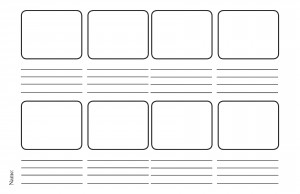
This is a very simple and straightforward procedure, get a sheet of paper, a few set of colored pens, pencils, crayons, markers etc. ,an eraser and a scale and get going.
But a few things could help make the process more systematic like
1. Get a sheet of paper and draw a grid
You might be wondering why a grid?
The reason for this is fairly simple, grid helps us in positioning of items on web page.
It is easier to align elements by using grid rather than using guess work.
2. Sketch out!
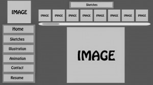
Draw the layout with as little details as possible.
Replace the lines of content with simple straight lines or “Content goes here”.
The reason of the storyboard is to get a grasp of how the site should appear and not the actual site itself.
3. Color it & visualize the storyboard
Last step is to add color to the storyboard.
The Storyboard need not be the exact replica of the site, but atleast it helps us in understanding how different colors would mesh well and which won’t.


8 Comments. Leave new
Good one!
nicely written Mujhthaba 🙂
You’ve explained it in such a simple and easy way! Good. 😀
Beautifully wriien…
Written *
Another fntastic and creative read.
Simple yet interesting work!!
great work…