When you are in front of your PC or laptop, wondering how you should start your presentation, nothing but blank spaces come to your mind. The question- “From where to start” leaves you sweating profusely and you start losing your temper and mind. If the above situation applies to you every time you are handed over a project, worry not brother/sister, I come to your rescue.
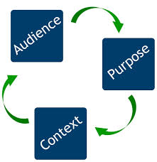
Since I cannot personally take up every desperate call, I present to you the basics of making a presentation from the scratch. All you need to do is to take care of three very easy things- purpose, audience and context.
PURPOSE- While every presentation may seem the same to you, they all have different purposes. Some are for training, some are for parting information, some are for convincing the clients while some are for dealing with the issues at hand. Every situation demands for a different tone, content and method of presentation. You cannot sound bossy in a presentation to clients, neither should you bore the trainees to death with numbers and data and you need not particularly be convincing when you are presenting facts and figures. Find out the core motive behind the presentation and set your mind accordingly.
AUDIENCE- What to say and to whom to say! The category of your audience is a major aspect of your presentation. You cannot joke around your clients, it has to be all business. But with your trainees, you can break the ice and play around a little. That not only makes you effective with the listeners but also adds to your personal charm.
CONTEXT- Know why, where, when and how the presentation is to be made. There is no harm in probing for details if you want to do good. Knowing everything helps you utilize your surroundings to the betterment of your content.
So the next time you feel a little nervous about some upcoming presentation, keep in mind- PURPOSE, AUDIENCE and CONTEXT.


27 Comments. Leave new
Well written 🙂
excellent and relevant article…helpful too
well explained
In my opinion , a presentation should contain less of text and written material and more of pictures , symbols.”
It is because , written material makes a presentation dull and audience sluggish.
Good points!
Liked it.
Great tips!
good job 🙂
Very apt and to-the-point. Practical and useful.
True true! Nicly written!
Nicely*
well Structured Article 😀
all points are correct… purpose audience context !!
Great work!!!
Very well written!
very informative,learn new things.
The points mentioned in this are perfect 😀
GOod work 😀
Nice
Well explained!
Well written.
Very useful!
Helpful in every field, every day. Good job.
very well written..liked it!!
Very well written keep going
Well articulated and efficiently described!
Very informative!
Amazing work!