Kagi Charts
Kagi charts are price charts with thick and thin vertical lines connected by short horizontal lines. Kagi charts only add a new vertical line when prices have reversed enough to cancel the current uptrend or downtrend. Until such a reversal occurs, a Kagi chart will only move up (or down) in its current column. These charts do not have constantly spaced time axes.
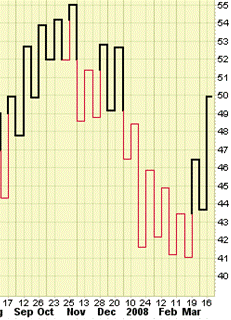
Example of a Kagi chart
The word “Kagi” or “key” comes from the Japanese art of woodblock printing. Hence Kagi charts are sometimes referred to as “Key charts.”
The thickness of the Kagi line changes depending on price action. The thick line is called the ‘yang’ line and the thin line is called the ‘yin’ line. The locations where the line changed from moving higher to moving lower are called “shoulders” and the locations where the line changed from moving lower to moving higher are called “waists”. Whenever a yin (thin) line moves above the previous shoulder, it turns into a yang (thick) line. Similarly, whenever a yang line moves below the previous waist, it turns into a yin line.
The Kagi line will continue to move up (or down) until prices reverse by a specified amount. When that happens, a short horizontal line is added as well as a new vertical line which extends to the new closing price. There are several ways to specify the reversal amount – in absolute points, as a percentage, or by using the Average True Range (ATR) of recent prices (discussed later).
Interpretation
When the Kagi line goes from thin to thick, prices have just exceeded their previous important high – that’s a bullish signal. The opposite is also true. When the Kagi line goes from thick to thin, prices have just fallen below their previous low, not a good sign for things to come. Standard support/resistance, trend and chart pattern analysis is more easily identified on Kagi charts due to their neat appearance.
Heiken Ashi Candles
The Heikin-Ashi chart appears similar to candle stick charts but the method of calculation and plotting of the candles on the Heikin-Ashi chart is different. Here candles are calculated and plotted using some information from the previous candle:
- Close price: the close price in a Heikin-Ashi candle is the average of open, close, high and low price.
- Open price: the open price in a Heikin-Ashi candle is the average of the open and close of the previous candle.
- High price: the high price in a Heikin-Ashi candle is chosen from one of the high, open and close price of which has the highest value.
- Low price: the low price in a Heikin-Ashi candle is chosen from one of the high, open and close price of which has the lowest value.
Heikin-Ashi candles are related to each other because the close and open price of each candle should be calculated using the previous candle close and open price. The high and low price of each candle is also affected by the previous candle. Hence, this makes a Heikin-Ashi chart slower than a candlestick chart and its signals get delayed.
Example of a Heikin-Ashi Chart
Renko Charts
The word “Renko” comes from the Japanese word “Renga” meaning “bricks.” The squares are formed on a Renko chart is referred to as “bricks.”
Renko charts have a pre-determined “Brick Size” that is used to determine when new bricks are added to the chart. If prices move more than the Brick Size above the top (or below the bottom) of the last brick on the chart, a new brick is added in the next chart column. Hollow bricks are added if prices are rising and black bricks are added if prices are falling. Only one type of brick can be added per time period. Bricks are always with their corners touching and no more than one brick may occupy each chart column. It’s important to note that prices may exceed the top (or bottom) of the current brick. Again, new bricks are only added when prices completely “fill” the brick.
For example, for a 5-point chart, if prices rise from 98 to 102, the hollow brick that goes from 95 to 100 is added to the chart BUT the hollow brick that goes from 100 to 105 is NOT DRAWN. The Renko chart will give the impression that prices stopped at 100.
It is important to note that Renko charts may not change for several time periods. Prices have to rise or fall significantly in order for bricks to be added.
Interpretation
Hollow bricks are bullish and black bricks are bearish. Renko charts are most useful in identifying trends and trend direction because they screen out moves that are less than the brick size. In order to avoid losses from sudden market movement, many traders wait until 2 or 3 bricks appear in a new direction before taking a position.
Apply for Technical Analysis Certification Now!!
http://www.vskills.in/certification/Certified-Technical-Analyst
