Value analysis is based on the application of a systematic work plan that may be divided into six steps: orientation/preparation, information, analysis, innovation/creativity, evaluation and implementation and monitoring. The application of value analysis only needs to make use of basic techniques such as Matrixes, Pareto chart, PERT and Gantt diagrams, etc. in most of the value analysis steps.
Some of the major advantages in using value analysis can be summarized in the following ideas:
- A high customer orientation, focusing on those aspects of the product/service that better satisfy customer needs.
- Cost reduction by eliminating functions that do not supply specific advantages to satisfy customer requirements/needs.
- New ideas that arise from the creativity/innovation phase and may add radical changes and therefore competitive advantages that will be regarded by the market.
- A new systematic mentality to be taken into account for next designs of new products or to systematically improve the existing ones.
The problems that may arise during the application of value analyses can be of different nature. In order to arrive at a successful completion of the process, one has to bear in mind the following ‘rules’:
- Avoid making generalizations and superficial statements – it is important to be precise at every moment.
- Collect, determine and examine all costs involved – only when one is cost conscious will it be possible to determine the value of the thing being assessed.
- Make use of information from the best possible sources.
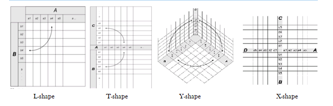
Matrix Diagram
It is also known as matrix or matrix chart as it uses a matrix to display information. The matrix diagram displays relationship amongst two, three or four groups of information like the strength of relationship amongst the group, the roles played by various groups, etc. It helps in analyzing the correlations between groups of information. It enables systematic analysis of correlations. Six different matrix shaped diagram are possible: L, T, Y, X, C and roof–shaped, depending on how many groups must be compared.
Relationship amongst two groups of entities is done by an L–shaped matrix or roof shaped matrix. T–shaped, Y–shaped or C–shaped matrix are used to show relationship amongst three groups and four groups, X–shaped matrix is used. Various matrix types showing relationship is listed below
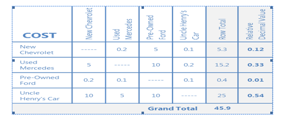
Prioritization Matrix
It is used to prioritize is to arrange or deal with in order of importance. A prioritization matrix is a combination of a tree diagram and a matrix chart and used to help decision makers determine the order of importance of the activities. It narrows down options by systematically comparing choices through the selection, weighing, and application of criteria.
It quickly surfaces basic disagreements, forces the team to narrow down all solutions from all solutions to the best solutions, limits “hidden agendas” by bringing decision criteria to the forefront of a choice and increases follow-through by asking for consensus after each step of the process.
Developing a prioritization matrix – It involves five simple steps, as
- Determine criteria and rating scale – Determine the factors to assess the importance of each entity. Choose factors that will clearly differentiate important from unimportant which are the criteria like the value it brings to the customer, etc. Then, for each criteria, establish a rating scale to use in assessing how well a particular entity satisfies that criteria.
- Establish criteria weight – Place criteria in descending order of importance and assign a weight.
- Create the matrix – List criteria down the left column and the weight and names of potential entities across the top in an L-shaped matrix to judge the relative importance of each criterion.
- Work in teams to score entities – Review each entity and rate the entity on each of the criteria. Next, multiply the rating for each criterion by its weight and record the weighted value. After evaluating the entity against all of the criteria, add up the weighted values to determine the entity’s total score.
- Discuss results and prioritize list – After entities have been scored, undertake a discussion to compare notes on results and develop a master list of prioritized entities that everyone agrees upon.
- An example of prioritization matrix where, 10 is much less expensive, 5 is less expensive, 1 is same cost, 0.2 is more expensive and 0.1 is much more expensive
Gantt Chart
It is a graphical chart, showing the relationships amongst the project tasks, along with time constraints. The horizontal axis of a Gantt chart shows the units of time (days, weeks, months, etc.). The vertical axis shows the activities to be completed. Bars show the estimated start time and duration of the various activities. A Gantt chart shows what has to be done (the activities) and when (the schedule) as shown in the figure below
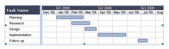
Milestone Charts – Gantt charts are often modified in a variety of ways to provide additional information. One common variation is milestone charts. The milestone symbol represents an event rather than an activity; it does not consume time or resources.
CPM/PERT Chart
CPM or “Critical Path Method” – It is a tool to analyze project and determine duration, based on identification of “critical path” through an activity network. The knowledge of the critical path can permit project managers to change duration. It is a project modeling technique developed in 1950s and is used with all forms of projects. It displays activities as nodes or circles with known activity times.
CPM is a diagram showing every step of the project, as letters with lines to each letter representing the sequence in which the project steps take place. A list of activities is required to complete the project and the time (duration) that each activity will take to complete, along with the sequence and dependencies between activities. CPM lays out the longest path of planned activities to the end of the project as well as the earliest and latest that each activity can start and finish without delaying other steps in the project. The project manager can then, determine which activities in the project need to be completed before others and how long those activities can take before they delay other parts of the project. They also get to know which set of activities is likely to take the longest, also called as the critical path which is also the shortest possible time period in which the project can be completed.
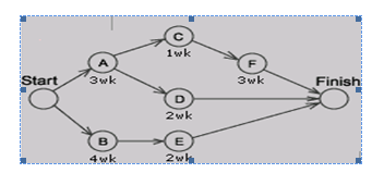
PERT Chart – A PERT chart (program evaluation review technique) is a form of diagram for CPM that shows activity on an arrow diagram. PERT charts are more simplistic than CPM charts because they simply show the timing of each step of the project and the sequence of the activities. In PERT, estimates are uncertain and ranges of duration and the probability that activity duration will fall into that range is taken whereas CPM is deterministic.
A PERT chart is a graphic representation of a project’s schedule, showing the sequence of tasks, which tasks can be performed simultaneously, and the critical path of tasks that must be completed on time in order for the project to meet its completion deadline. The chart can be constructed with a variety of attributes, such as earliest and latest start dates for each task, earliest and latest finish dates for each task, and slack time between tasks. A PERT chart can document an entire project or a key phase of a project. The chart allows a team to avoid unrealistic timetables and schedule expectations, to help identify and shorten tasks that are bottlenecks, and to focus attention on most critical tasks. It is most useful for planning and tracking entire projects or for scheduling and tracking the implementation phase of a planning or improvement effort.
Developing PERT Chart
- Identify all tasks or project components – Ensure the team has knowledge of the project so that during the brainstorming session all component tasks needed to complete the project are captured. Document the tasks on small note cards.
- Identify the first task that must be completed – Place the appropriate card at the extreme left of the working surface.
- Identify any other tasks that can be started simultaneously with task #1 – Align these tasks either above or below task #1 on the working surface.
- Identify the next task that must be completed – Select a task that must wait to begin until task #1(or a task that starts simultaneously with task #1) is completed. Place the appropriate card to the right of the card showing the preceding task.
- Identify any other tasks that can be started simultaneously with task #2 – Align these tasks either above or below task #2 on the working surface.
- Continue this process until all component tasks are sequenced.
- Identify task durations – Reach a consensus on the most likely amount of time each task will require for completion. Duration time is usually considered to be elapsed time for the task, rather than actual number of hours/days spent doing the work. Document this duration time on the appropriate task cards.
- Construct the PERT chart – Number each task, draw connecting arrows, and add task characteristics such as duration, anticipated start date, and anticipated end date.
- Determine critical path – The project’s critical path includes those tasks that must start or finish on time to avoid delays to the total project. Critical paths are typically displayed in red.
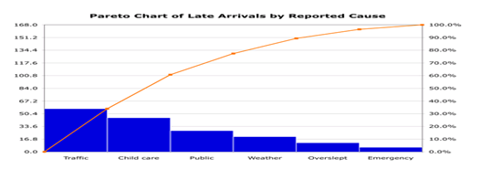
Pareto charts
It is a type of bar chart in which the horizontal axis represents categories which are usually defects, errors or sources (causes) of defects/errors. The height of the bars can represent a count or percent of errors/defects or their impact in terms of delays, rework, cost, etc.
By arranging the bars from largest to smallest, a Pareto chart determines focusing on which categories will yield the biggest gains if addressed, and which are only minor contributors to the problem. It is the process of ranking opportunities to determine which of many potential opportunities should be pursued first. It is used at various stages in a quality improvement program to determine which step to take next.
Pareto Chart Development – It involves the following steps
- Collect data on different types or categories of problems.
- Tabulate the scores.
- Determine the total number of problems observed and/or the total impact. Also determine the counts or impact for each category.
- For small or infrequent problems, add them together into an “other” category
- Sort the problems by frequency or by level of impact.
- Draw a vertical axis and divide into increments equal to the total number observed. Do not make the vertical axis as tall as the tallest bar, which can overemphasize the importance of the tall bars and lead to false conclusions
- Draw bars for each category, starting with the largest and working down.
- The “other” category always goes last even if it is not the shortest bar