Dynamic page support
HTML 5 was developed to help Web application developers, so there are a lot of new features to make it easy to create dynamic HTML pages:
Context menus – HTML 5 support the usage of context menus in web pages and applications. The contextmenu attribute refers to the <menu> element browser should render when a context menu is requested by the user (e.g. using the right mouse button or the menu or hyper key on keyboards. The context menu appears when the user right-clicks on an interface element. The contextmenu attribute is the ID of a <menu> element to open when the user right clicks on the element with this attribute.
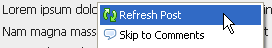
The HTML5 context menu specification allows creation of custom context menus for given blocks within simple menu and menuitem elements. The menu information lives right within the page so there’s no need to create a custom plugin. As shown in the example
|
HTML code <section contextmenu=”mymenu”> <!– Sample menu inside the element that will use it –> </section> <menu type=”context” id=”mymenu”> <menuitem label=”Refresh Post” onclick=”window.location.reload();” icon=”/images/refresh-icon.png”></menuitem> </menu> |
Browser output
|
async attribute – This is added to the script tag to tell the browser that the script that will be run asynchronously as soon as it is available so that it doesn’t slow down the load and display of the rest of the page. The async attribute is a boolean attribute. When present, it specifies that the script will be executed asynchronously as soon as it is available. The async attribute is only for external scripts and ways an external script can be executed are
- If async=”async”: The script is executed asynchronously with the rest of the page (the script will be executed while the page continues the parsing)
- If async is not present and defer=”defer”: The script is executed when the page has finished parsing
- If neither async or defer is present: The script is fetched and executed immediately, before the browser continues parsing the page
An example usage is as
<script type=”text/javascript” src=”demo_async.js” async=”async”></script>
The <details> element – The details element is like an widget from which the user can obtain additional information. <details> is used to create an accordion-like widget that the user can toggle open and closed. Inside the element, any content can be placed. It is the wrapper for the content to show or hide, and <summary> contains the summary and title of the section. The <summary> is not usually required but, if absent, the browser will use some default text (in Chrome: “details”). It has an attribute as
| Attribute | Detail |
| Open | Specifies whether the details should be open (visible to the user) or closed (hidden from the user). |
An example of usage is given as
<details>
<summary>Get in touch</summary>
<p>Interested in sponsoring? Get in touch.</p>
</details>
The <menu> element – It is used for groups of controls (a, input, button) or the inputs should perform a function within the page. It is to be used for a list of commands and is an interactive element and more likely to be used exclusively in Web Applications. Usually JavaScript interaction is linked with clicking on a menu item. A dropdown menu with a options is shown as
<menu type=”toolbar”>
<li>
<menu label=”Payment”>
<button type=”button” onclick=”Cheque_new()”>Cheque</button>
<button type=”button” onclick=”DD_open()”>DD</button>
<button type=”button” onclick=”Cash_save()”>Cash</button>
</menu>
</li>
</menu>
It has the following attributes
| Attribute | Detail |
| label | A visible label for the menu |
| type | Specifies the type of menu to display. Default value is “list” |
The <command> element – It is used for specifying a command that the user can invoke. A command is the abstraction behind menu items, buttons, and links. Once a command is defined, other parts of the interface can refer to the same command, allowing many access points to a single feature to share aspects such as the disabled state.
It provides an abstraction layer between UI and commands, so that multiple UI elements refer to the same command. Thus, giving flexibility of having one command element, rendered in a menu, that is also invoked via a URL in the middle of the page as well as a button at the bottom of the page. Disabling the command disables all access paths (url/button/menu) to the action behind the command.
An example implementation of the element is
<command id=”doThat” onclick=”doThat()”></command>
<input type=”button” command=”doThat” value=”click me to do that”>
<menu command=”doThat”>This does that too</menu>
Then, to indicate that the user can not do that in the context, can be implemented as
document.getElementById(‘doThat’).disabled=true;
| Attribute | Detail |
| checked | Specifies checking of the command when the page loads in case of radio or checkbox type |
| disabled | The command is disabled |
| icon | An image represents the command |
| label | The name of the command to be shown |
| radiogroup | The name of the group of commands for radio type to toggle as group. |
| type | The type of command |
Apply for HTML5 Certification Now!!
http://www.vskills.in/certification/Certified-HTML5-Developer
