CSS uses two types of lengths which are
- Absolute.
- Relative
Absolute Lengths
They are compatible with different operating system, browser and screen resolution and are independent of any other measurement. They use real-world units as ‘in’ for inches, ‘cm ‘ for centimeters, ‘mm’ for millimeters, ‘pt’ for points where 1 point equals 1/72nd of an inch and ‘pc’ for picas where 1 pica is equal to 12 points. They are used for measurement of a print document which needs real-world measurements.
Relative Lengths
They depend on the environment like the screen resolution or the size of a font. They are used for onscreen layout. They include ‘em’ for length relevant to the nearest font size, ‘ex’ for the height of the letter x for the relevant font, ‘px’ for pixels which is relative to screen resolution and ‘%’ for percentage where length is calculated as per the property it is being applied to.
Length units in CSS are illustrated as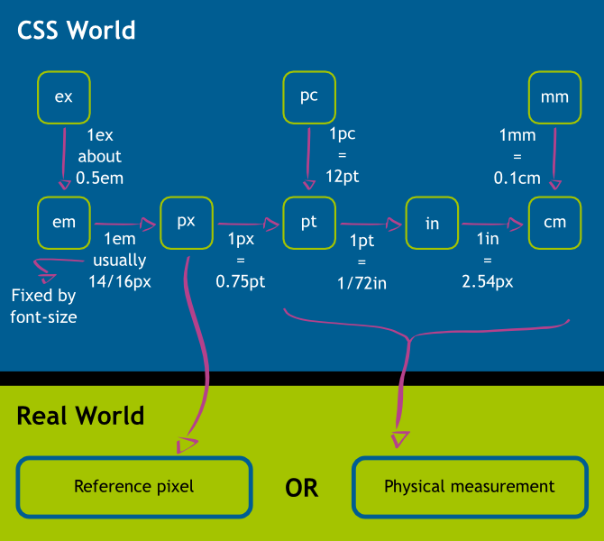
